-
Type:
Bug
-
Resolution: Duplicate
-
Priority:
 Major - P3
-
None
-
Affects Version/s: 1.14.0
-
Component/s: Compass
-
None
-
None
-
None
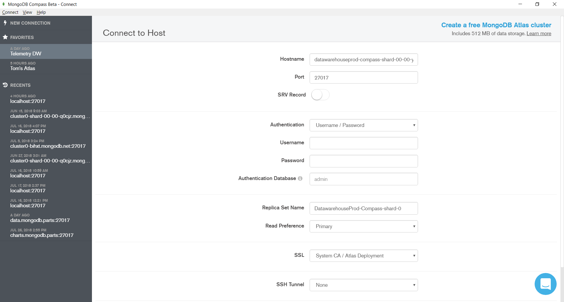
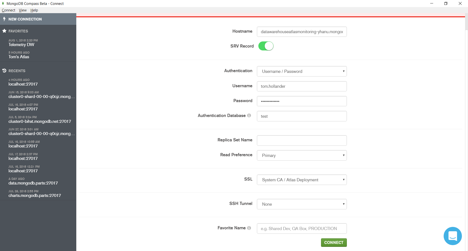
On my laptop screen (1920 x 1080), the Connect button does not fit on the screen without scrolling, if any authentication method except for "None" is chosen:
Given that the Connect button is critical and often the only control you need to use on this page (if you paste a URI), it should be accessible without scrolling.
Furthermore, if the connection fails for any reason, you cannot see the error message when the page is scrolled down to make the Connect button accessible:

The total available real estate on this page is quite high, so it would be much better to organise it in a way that makes the Connect button and error messages visible at the same time (and really, at all times).

- depends on
-
COMPASS-3278 Connect Screen Improvements
-
- Closed
-
- related to
-
-

- Closed
-