-
Type:
Improvement
-
Resolution: Duplicate
-
Priority:
 Major - P3
-
None
-
Affects Version/s: None
-
Component/s: None
-
43,595.06
-
None
-
None
I think readability could be improved via adding a margin to the source.wiredtiger.com documentation, especially for people using wider screens. Currently a line of text will span the available space in the browser.
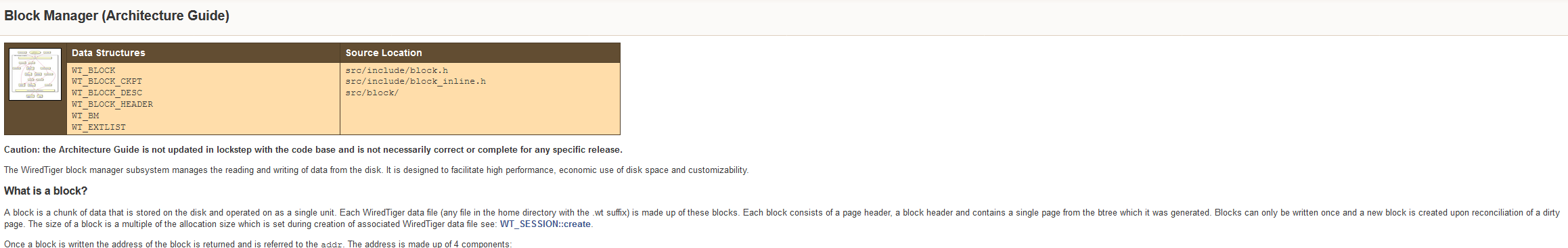
Example here:

- duplicates
-
WT-8004 Create a read order for the architecture guide
-
- Closed
-